Generative COVID-19 Art
Context
Having worked on COVID-19 data at the NIH for over a year, I’ve grown familiar with data visualization and pipelining for research purposes. I took this opportunity to view data through a more artistic lens.
The COVID-19 pandemic has claimed countless lives, leaving families devastated. We are eager to return to “normal” when we’re truly not out of the woods yet. So much carnage has ensued, but we’re told to move on and get back to work. I’ve represented this phenomenon through abstract art.
Final Product
👾Here’s the code🧑🏾💻
Below are screenshots of the generative art I created:
Each circle represents the cumulative number of COVID-19 deaths in a randomly chosen month for a state within the USA.
As viewers, we encounter a pleasant piece of art with uplifting colors and basic shapes. As we dig deeper, we realize that the art is based off of our grim reality, painting over our suffering.
How does it work?
The user first encounters these abstract translucent circles without any context. As they scan the image, they may notice the shuffle and info buttons. When they click the info button, a menu pops up with a description of the scene.
The pop up displays the point in time of the pandemic (Month + Year) that this illustration is generated in. The example above was generated from October, 2020. For each state, the cumulative number of COVID-19 deaths is displayed at the aforementioned time point. Finally, the user is provided with a link to the original data.
To generate a new snapshot, the user can press the shuffle button. Doing so will create a new art piece representing the number of cumulative COVID-19 deaths at a randomly chosen time point during the pandemic.
Where’s the data coming from?
Here’s a link to the data source. The data was obtained from the US Center for Disease Control and Prevention (CDC), and is titled United States COVID-19 Cases and Deaths by State over Time. This data set is an aggregation of the most recent numbers from local, state, territorial, and other jurisdictions.
Data Inconsistencies
Naturally, the data accuracy depends on the heterogenous processes of each jurisdiction. For example, New York state’s data does not include NYC, while other states report big cities within their cumulative counts.
Note that the CDC used death certificates to calculate the number of casualties. This may cause some states to show lower death counts than from other reporting outlets.
Several states, like Arkansas, were completely missing death count data from the CDC. These states displayed no circles in the art.
Inspiration
Here’s a beautiful dynamic art piece on the homepage of chart.js I found:
The illustration looks so light and minimalist. I wanted to contrast that peaceful imagery with something heavy that relates to our current times. With my newly acquired Javascript skills in p5.js, I decided to finally pursue dynamic data visualization, using a dataset that I was familiar with from my old life at the NIH.
Coding in p5.js
Python and Java are my strong-suit, so jumping into JavaScript based p5.js was a smooth transition. Now, I’m able to code the interactive data visualizations I’ve always dreamed of!
First, I had to grab the data from the CDC and transform it into a digestible format for my visualization. My p5.js code grabbed a query link provided by the CDC and stored it in a 2D array, transforming the format in the process.
Aggregating over multiple dates in a month
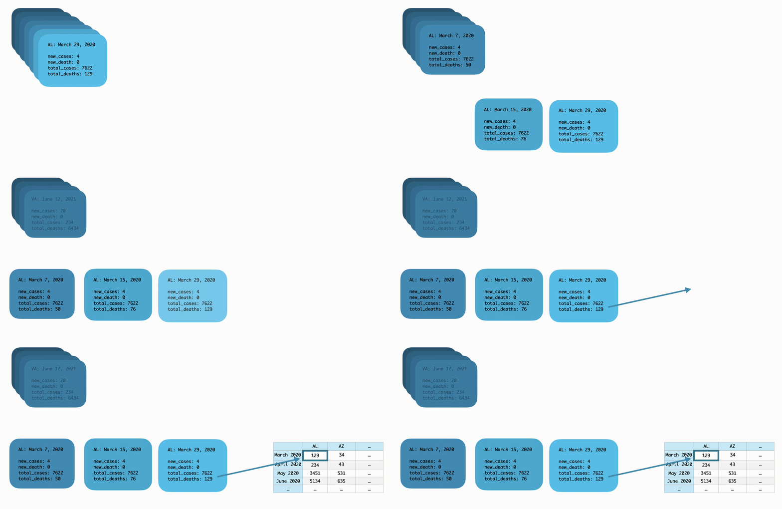
The CDC data query returns a JSON file, represented by the stacked blue blocks on the left in the image below. Each block stores the COVID-19 data for one state at a specific date (Month, Day, Year). For my visualization I needed only Month+Year as a time point.
In general, my code looks at all blocks for a state within a given month. It then finds the block with the highest number of total_deaths and puts that data into a 2D matrix in which each column stores the cumulative number of COVID-19 deaths at each Month+Year row.
Using the example above, the code sees 3 blocks for Alabama within the month of March 2020. It determines that March 29, 2020 has the highest number of cumulative deaths within that month, 129. Then, it places 129 into the cell for Alabama at time point March 2020. The script repeats this algorithm for every state at every month.
We end up with the 2D matrix on the right of the illustration above.
When the user clicks the shuffle button, my code picks a random row in that 2D matrix and displays all the number of deaths for each state within that row. Here’s what that looks like in the code:
Future Improvements
I’d like to eventually build in the hovering functionality where a user can simply hover their mouse over a circle and the program would display information for that circle. Also, I’d like to find a way to make the software as a whole less laggy through memory optimizations perhaps.
I would also add multiple datasets and generate art from similarly formatted data types.
Learning Outcomes
Strengthened JSON query skills + data manipulation in JavaScript
Gauged limitations / differences between Python and p5.js
Data viz doesn’t always have to be for scientific publications…
It can be fun an creative!


